Why screenshots are a perfect fit
Screenshots are crisp: text is rendered by the operating system at a known size, and app backgrounds are usually flat colours. That makes them ideal for invisible edits — the editor can tell exactly which pixels are text and rebuild a flat background perfectly.
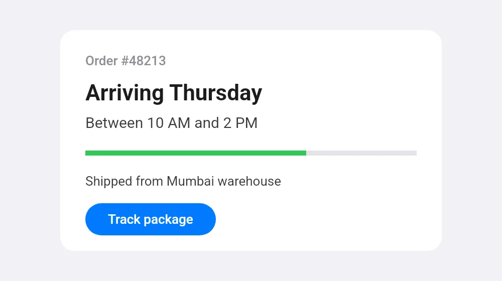
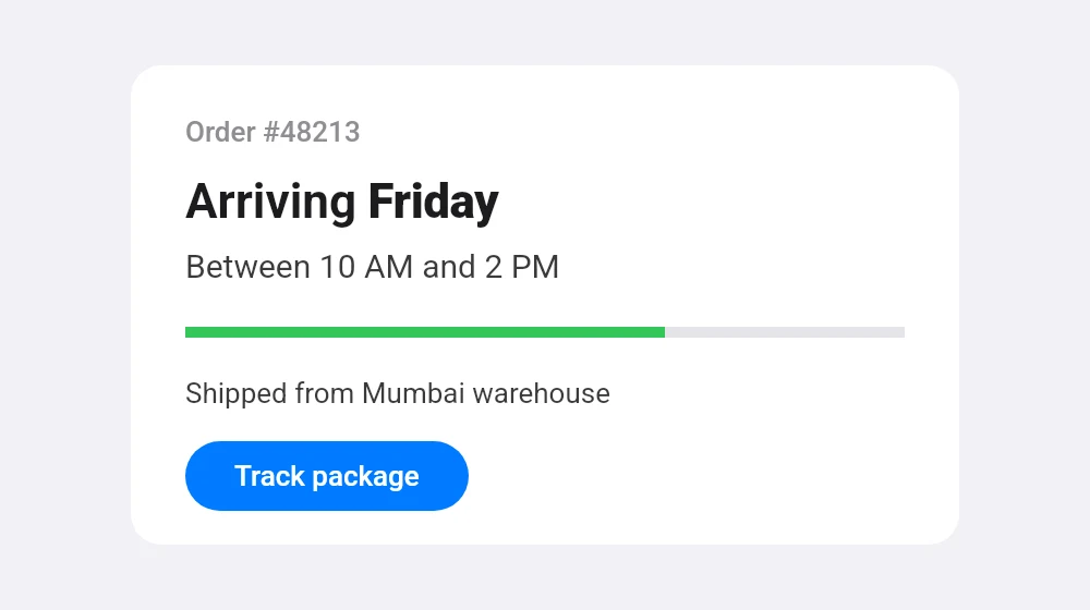
Common uses include fixing a typo in a screenshot for a presentation, updating a price or a date in a product mock-up, translating a label for documentation, or blurring out and replacing a name before sharing.
Getting the cleanest result
- Use the original screenshot rather than a copy forwarded through a chat app, which compresses it.
- Text inside a dimmed area behind a popup is supported; if a label is missed, use Select area around it.
- For a whole label that changes length a lot, choose Whole line and the right alignment.
- Hold the eye button to compare with the original before you download.
How screenshot fonts are matched
Each platform draws its interface in its own typeface, and the editor tries the closest open font for each: Roboto for Android, which is the very same font; Inter for iPhone and Mac text set in Apple’s SF Pro, a closely related design; Open Sans for Windows’ Segoe UI; and Arimo, which has the same letter widths as Arial and Helvetica, for many websites.
It compares each candidate with the letters in your screenshot and picks the family, weight and size that overlap best. Screenshots from high-resolution phone screens give the most detail to match against. If an app uses its own brand font, pick another font from the menu and adjust the size until it lines up.
Use responsibly
Edited screenshots can mislead. Please don’t use the tool to fake conversations, payments, bookings or official confirmations — that may be illegal and is against our terms. Edit screenshots for presentations, design, documentation and your own records.